Monday, December 31, 2007

4 Characteristics of User-Friendly Websites

Source: dailyblogtips.com

A primary goal of any website or blog should be to provide its visitors with a pleasant and fulfilling experience. Regardless of what market the website is targeting, the opinions of users will play a huge role in determining the site’s level of success. Visitors that have positive experiences will be much more likely to come back later, refer friends, sign up for a newsletter, purchase a product, submit an inquiry about a service, etc.

When developing a website, the user’s wants and needs should always be in the forefront of the decision making process. It doesn’t matter what type of website you run, it needs to be user-focused. Unfortunately, sometimes it’s easy to get caught up in the design and development process and create a site that satisfies the designer or the owner but doesn’t really provide visitors with much value.

What makes a website user-friendly? There are probably an endless number of factors, but let’s look at five of the major ones.

1. Page Load Speed

Although high-speed internet connections are becoming more and more common, there is still a large number of internet users that are on slower dial-up connections. Even with high-speed connections some pages just don’t load very quickly. Most of your visitors will be fairly impatient and pages that load slowly could chase them away. At the very least, slow loading times will reduce the number of pages that they’ll visit on your site.

Knowing your site’s audience can really help to know how your pages should be designed. A program like Google Analytics will show you the percentage of your visitors that are using different internet connections. Based on the numbers you can get a good idea of what type of impact page load speed will have on your overall audience. If your site attracts a high percentage of users with dial-up connections, you should be sure to keep pages loading as quickly as possible. If a very high percentage of visitors are using high-speed connections, you may be able to add a few extra elements to your pages.

Factors that influence the load times of pages include the number and size of images, extra items like flash, the amount of excess code (example, designing with a table-based layout instead of CSS), and the size of your pages. (Read more about website optimization).

2. Accessibility

If someone can’t use or access your website it serves no purpose for that visitor. Accessibility of websites has become a bigger priority for designers and developers in recent years, but there is still a long way to go. Even major corporations have struggled to achieve complete accessibility. Target was even sued over the accessibility of its website for handicapped individuals.

Some of the easiest things that you can do to improve the accessibility of your site include using alt tags for all images, use valid HTML and CSS coding, avoid frames, and allow text to be re-sized by visitors. There is of course much more to accessibility, which was covered in detail by 456 Berea St.

3. Navigation

All users want to be able to move through the website to find what they want. A huge factor in being user-friendly is providing simple and intuitive navigation. Major areas of navigation should be located consistently on all pages. Using common elements that users expect to find, like About pages and Contact pages will help as most internet users have come to expect them and will look for them at times.

A general rule of thumb is that any page on your site should be reachable with 2 clicks from your home page. For larger sites this probably isn’t realistic, but offering a sitemap and/or a sitewide search can really help.

Another important factor with navigation is that user’s shouldn’t have to guess where they will end up if they click on a link. Regardless of whether the link is part of a navigation menu, or if it is simply in the body of the text, visitors should understand where the link will lead them.

4. Information

Visitors are coming to your site for a reason. Whatever that reason may be, you want to provide them with what they are seeking. Are they coming to find basic information on your business’ services? Are they coming to read in-depth articles on a particular subject? Whatever the case may be, the information that your website provides needs to sufficiently meet the expectations of visitors.

A blog like this one will need to provide its readers with great, insightful articles in order satisfy its visitors. The website of a restaurant may need to provide hours of operation and a menu in order satisfy its visitors. Obviously, each situation is different. In order to have a user-friendly website you need to anticipate what visitors will expect to find at your site, and then put it right in front of them.

I know this is just the tip of the iceberg on the subject of user-focused websites. What factors do you feel are important (either from the perspective of a visitor or a designer)?

Sunday, December 30, 2007

2007 In Numbers: More People Using Yahoo Mail This Christmas Than Gmail

Source: techcrunch.com

Email remains one of the most popular of online services. Companies such as Yahoo, AOL and Microsoft have offered free online email since the earliest days of the internet. Google was late the party, launching Gmail in April 2004. Where as Google has come to dominate many of the verticals it enters, email hasn’t been one of them. This Christmas many more people will be using Yahoo! Mail to send Christmas well wishes than will be using Gmail.

yg1.jpg

Statistically this is where tracking online email popularity becomes difficult. This year Microsoft has launched Windows Live Hotmail with users logging in via its various “Live” properties, making it difficult to place exactly how many users were logging in and using Live and Hotmail email addresses. In April comScore placed Hotmail at 47 million unique visitors. No figures were available from comScore on Live.com traffic (which includes search and related traffic as well) or Windows Live Mail, although sites such as Live.fr hit 154,000 uniques in November and Live.de did 1.39 million. AOL remains a fairly popular choice for email as well, with comScore reporting 42.3 million uniques in April.

There are still no shortage of Gmail fans out there, but at its current growth rate Google wont be catching Yahoo! Mail until 2010. Yahoo showed 3.21% growth for the 12 months to November 2007 compared with Gmail’s 53.60%

yg2.jpg

Top 10 Startups Worth Watching in 2008

Source: wired.com

Credit crunch? Recession risk? You'd never know it, judging by the frenzy of startup activity. In fact, it's a pretty good time to start a company. Generous payouts from Web 1.0 IPOs and more-recent acquisitions have given rise to a new generation of angel investors and venture capitalists. Plus, getting acquired by Google is an attractive and plausible exit strategy for many entrepreneurs. Those factors have combined to make a startup market almost as frothy as the dot-com bubble.

We say almost, because the spending is a bit less lavish than before, and because -- unlike 1999 -- many of the new crop of startups have real promise. Here are 10 pre-IPO, pre-acquisition companies worth watching in 2008.

23andMe

There's a lot you could buy with $1,000, but for that price 23andMe offers something never before sold to the masses: your DNA. Are you predisposed to prostate cancer? Glaucoma? Heart disease? 23andMe, profiled recently in Wired, can tell you. The implications could rock the medical world -- and the ethical one. As the science of genomics continues to improve, 23andMe should be able to provide ever-better information. In 2008, it will also provide social networking between customers who share traits ranging from ethnic origins to disease profiles.
  • Founders: Linda Avey and Anne Wojcicki
  • Funding: $12 million, from Genentech, Google and New Enterprise Associates
  • Employees: 30

37Signals

There's a reason nobody ever uses the phrase, "It's as simple as computer programming." But Chicago's 37Signals has made life simpler for programmers and small businesses alike with products such as Basecamp (project management software) and an increasingly popular open source web framework called Ruby on Rails. The company ditches the philosophy of "more features, more better" in favor of simplicity and accessibility: Focus only on the most important features and make things easier to use. The company itself embodies its keep-it-simple philosophy: Fewer than 10 staffers, working from humble offices, create programs quickly and nimbly adapt them based on user feedback. 37Signals released version 2.0 of Ruby on Rails in December, which should give many programmers a happy new year.
  • Founders: Jason Fried, Ernest Kim, Carlos Segura
  • Funding: Undisclosed sum from Bezos Expeditions
  • Employees: 8

AdMob

When AdMob launched in 2005, its prospects did not look bright. As a startup mobile-advertising network, it would have to compete with Google, and how feasible is that? But AdMob has defied the odds. While Google is just four months into testing a mobile version of its advertising network, AdMob has already served 12 billion ad impressions to mobile users. As more consumers buy web-enabled mobile phones, the prospects for mobile advertising can only improve.
  • Founder: Omar Hamoui
  • Funding: Undisclosed Series A from Sequoia Capital; $15 million Series B from Accel Partners and Sequoia Capital
  • Employees: 65

BitTorrent

As a peer-to-peer, or P2P, download protocol, BitTorrent was perfect for illegal file sharing. But in late 2007, the parent company of that protocol -- also called BitTorrent -- unveiled a potentially disruptive new use for its P2P technology: a platform that software providers and media companies can use to help customers download high-resolution files faster (and legally). By reducing distribution hurdles, BitTorrent will make online video and software sales increasingly viable in 2008 and will challenge the notion that the idiot box is the primary way to get your CSI fix.
  • Founders: Bram Cohen and Ashwin Navin
  • Funding: $28.75 million from Accel Partners and DCM (formerly Doll Capital Management)
  • Employees: 60

Dash

Today, GPS is a one-way street, with a satellite beaming instructions to your device. You turn left because a chip inside your GPS device calculated that would the best route. In 2008, Dash

will chart a new course with Dash Express, a GPS that learns from its users. If a Dash owner is moving 5 miles per hour in a 45 mph zone, Dash servers will realize he's in traffic and warn other Dash drivers to choose faster routes. Sure beats calling 5-1-1.

  • Founders: Brian Smartt, Mike Tzamaloukas, Steve Wollenberg
  • Funding: $45 million from Kleiner Perkins Caufield & Byers, Sequoia Capital, Skymoon Ventures, Crescendo Ventures, ZenShin Capital Partners, Artis Capital, Gold Hill Capital, and several individuals
  • Employees: 85

Fon

You pay for internet access at home, so why must you pay for it again at the coffee shop, the airport and the hotel? That frustration spawned Spanish Wi-Fi startup Fon. It's a simple idea: Give and you shall receive. "Foneros" first agree to share their home wireless connections with other Fon customers using a special router, which splits the signal into public and private streams. In exchange, they get the privilege of using any of the network's wireless signals anywhere in the world for free. Fon has inked important deals with TimeWarner Cable in the United States, BT in Britain and Neuf in France, and its network has expanded to an impressive 600,000 registered users worldwide. Free global internet for the price you already pay at home? Sign us up!
  • Founder: Martin Varsavsky
  • Funding: Approx. $35 million from Skype, Google, Index Ventures, Sequoia Capital, Excite, Digital Garage and BT
  • Employees: Approximately 90 worldwide

LinkedIn

LinkedIn, a career-oriented social networking site, found 16 million users, yet until recently has been eclipsed by much larger, livelier competitors. Now, a much-needed upgrade has the 4-year-old startup looking pretty good after all. A new developer platform aims to bring LinkedIn networks to the web at large, starting with Business Week's website, which will show your connections to any companies mentioned in news articles you're reading. LinkedIn still emphasizes utility over frivolity, and that's just the way we like it. Instead of virtual hugs and stripper name generators, expect the site to add "modules" that gather news and events from your industry. The dull-but-useful strategy seems to be working: LinkedIn projects revenues of nearly $100 million in 2008 -- not too shabby compared to much larger Facebook's estimated $150 million for 2007.
  • Founders: Reid Hoffman, Allen Blue, Konstantin Guericke, Eric Ly, Jean-Luc Valliant
  • Funding: $27.5 million from Sequoia Capital, Greylock, the European Founders Fund, Bessemer Venture Partners, and numerous individual angel investors
  • Employees: 200

Powerset

It's gotten hard to imagine a world where Google doesn't dominate internet search, but some believe that if anyone can dethrone the king, it's Powerset. The San Francisco company is developing an alternative "natural language" search technology, which takes into account the actual meaning and context of words in a sentence. Of course, it's not the first time someone has tried to make computers think more like human beings, and HAL 9000 is still MIA. And despite an impressive demo at the TechCrunch 40 conference in September, Powerset's management has struggled recently, losing one founder (Steve Newcomb) while another (Barney Pell) stepped down from the CEO position. Even if Powerset's search engine doesn't make it to market in 2008, Silicon Valley will be closely watching to company for any signs of progress -- or lack thereof.
  • Founders: Steve Newcomb, Barney Pell and Lorenzo Thione
  • Funding: $12.5 million from Foundation Capital, The Founder's Fund and several angel investors
  • Employees: 60

Slide

In the battle of Facebook vs. the OpenSocial gang, there's one assured winner, and it's not even technically in the fight. Slide, the largest provider of third-party applications (aka "widgets") to websites and social networks, stands to win no matter which network comes out on top. (Slide's chief widget-making rival, RockYou, is also well in the mix.) Slide's success is only pegged to the social networking trend, which shows no signs of flagging in 2008.
  • Founder: Max Levchin
  • Funding: Initial funding from Max Levchin; a rumored $20 million from BlueRun Ventures, The Founder's Fund, Khosla Ventures, Mayfield Fund
  • Employees: 60

Spock

Google can search the web by keyword, but Spock gets more directly at a single question: What does the web know about you? By crawling the web for personal information and combining that with social network data, Spock creates a hub for information about actual people. Enter your name in Spock's pared-down interface and find out what the internet knows about you, or search by a keyword to find, say, ornithologists or sommeliers. Spock generates its profiles automatically, but individuals can "claim" theirs and correct any misinformation. In fact, you might want to check yours right now....
  • Founders: Jaideep Singh and Jay Bhatti
  • Funding: $8 million from Clearstone Venture Partners and Opus Capital
  • Employees: 25

A Beginner’s Guide To Freelance Business Processes

Source: freelanceswitch.com

Process schmocess. Who needs them eh? Well actually every business needs them, no matter how big or small you are; but if you’re a one-man freelancing business you might still be wondering why you need to bother with them?

Having effective processes in place can help you…

  • Spend less time on the boring, time-consuming aspects of your business
  • Build a client-generating machine
  • Let go of some of the reins and work out what tasks you can hand over to someone else (also known as outsourcing)
  • Set your business up to grow beyond the confines and limitations of a small, one-man band business without the additional hassle and growing pains

If you’re just starting out or you have no idea how to implement smarter processes in your business, then here’s a brief guide to implement some of the basics…

Basic Marketing Processes

Many freelancers hate marketing themselves and would far rather work in their business servicing clients than spend time generating new clients. If this sounds like you, then implementing some or all of the following, could make completing your marketing chores simpler and less arduous:

  • Plan out your prospect journey - plan out a sequence of all the steps that an ideal prospect could take on their journey with you before they become a client. This will include how and where you’d like them to find out about you initially; where they can go to get more information; the choices they have; and what they need to do to become a client.
  • Create ‘common enquiry’ email templates to respond to some of the more common requests you receive such as requests for more information about what you offer, requests for your prices, more details about how you work, your payment terms and how to respond to media enquiries.
  • Prepare some standard marketing materials such as client reference sheets or info packs for each of your individual services and products. These could include a price list and some testimonials and could be sent over as attachments to the above emails or snail-mailed to interested prospects.
  • Create a “marketing message bank” of the key marketing messages that you’ve defined for each of your target markets; whenever you need to create some marketing materials, you can then pick and choose or cut and paste from the headlines, bullet points and calls to action that you’ve got in your marketing message bank.

Operations & Service Delivery Processes

As you work in your business, begin to compile a basic manual for some of the typical things you do to run your business and service your clients effectively. A great way to start doing this is to make a note every time you’re doing something that you think someone else could do for you. These may include:

  • Bringing on a new client - tasks included in this process might be how you collect payment details; when you send out a welcome pack; how & where you enter client details into your CRM system or customer management spreadsheet.
  • Managing client billing - tasks in this process might include how & where you enter details into your invoicing system; how and when you send out your invoices; how you deal with and chase up missing payments.
  • Making a business purchase - tasks for this process might include how you raise a purchase order; how you purchase items with a company credit card; how and where to log the purchase in your business inventory; how and where to file the receipt.
  • Finishing work with a client - these tasks might include sending a “thank you” email; asking for feedback or a testimonial; how you plan to keep in touch with them and send details of further support available.
  • Prepare a range of basic “Company Info” sheets which detail the key information you’re likely to need for “official” purposes; this includes your official business/trading name, your company structure, date of incorporation if relevant, trademark and copyright info and the names and contact details of professionals like your bank, accountant, insurance advisor, lawyer.

Maximising People Productivity

The following suggestions can help improve not only your own personal productivity but also help prepare your business for introducing new people. Whether as employees, sub-contractors or outsourcers, improving and enabling their effectiveness to do their job means they won’t have to drain your time by asking you how to do something every 10 minutes…

  • Create a bookmarks folder of frequently accessed services in your browser - mine is called “Daily Admin”; if you work in a team, then use an online bookmarking service to share frequently used bookmarks.
  • Keep a folder of frequently used programs and software on your desktop or in the “quick start” menu of your computer and then create a USB key or zipped folder of these programs (with applicable licences of course) which you can share with any new team members who join you.
  • Create a folder of frequently used documents/templates on your desktop and/or share them using google docs or another file sharing service which lets your team access the resources they need.
  • Knowledge management for small businesses means gathering together in one easily accessible place, any useful tools and resources that will improve your and your team’s ability to do their jobs. This could include marketing resources, “how to” resources or any guides that you refer to regularly.
  • Create job spec sheets for all the roles required to run your business - yes, even if you currently fulfill all of them yourself! Doing this will not only help you improve your effectiveness in each role, it will help you define what you’re looking for when the time is right to expand; and will help ensure that the person you hire knows exactly what is expected of them in their role.

If all of this sounds a bit daunting and you have no idea where to start, then the key to creating and refining effective business processes is to start to log the key activities you do on a day-to-day basis. You’ll begin to notice the tasks that take up too much of your time, the tasks you hate doing and you wish someone else would do, and the tasks that you do on a regular basis but have always suspected there is a more efficient way of doing them.

When you have this list then start with these processes, take a step back and think about how you’d do them if you were starting all over again…then document them.

When the time comes to expand or outsource parts of your business, having the above basics in place will help you do this far more smoothly and effectively.

Thursday, December 27, 2007

Paper Prototyping

Source: A List Apart

As interfaces become ever more complex and development schedules seem to get shorter and shorter, you may find it useful to give up your user-interface modeling software for awhile in favor of something simpler. All you need is paper, pens, scissors, and your imagination.

Everyone loves paper
Just as a political party aims to be a “big tent,” product development teams should seek input from as many people as possible during the early part of a project’s design phase. Though HTML prototypes can be useful, they can also discourage those who are unsure what the medium is capable of. Paper prototypes, on the other hand, invite people with little-to-no technical background into the design process.

I cannot emphasize enough how important the inclusive quality of paper can be. Though some people shy away from paper prototypes because they feel they will not be taken seriously, I argue that many people are intimidated by a formal, highly technical design process and that the less “professional” nature of paper prototyping is a great way to lighten the mood and engage a more diverse group. Just offer plenty of paper, pens, scissors, and other materials for anyone to grab and use. If anyone feels nervous, let them eat the paste.

Easy iterations
Paper prototyping can also help improve the final product: the prototyping stage is the right time to catch design flaws and change directions, and the flexibility and disposability of paper encourages experimentation and speedy iteration. Instead of “deleting” hours worth of layout code you’ve used to position a column in the right place, you can draw a prototype, throw away the ideas that don’t work, and move on.

Built for your budget
If you are on a shoestring budget, paper is a great low-cost alternative to many software packages—and if you have a larger budget, you can use products like Post-it notes or tabbed index card dividers to make your paper prototypes more sophisticated. If it helps your team, you can print full-color objects to use in your prototyping sessions. You might want a low-quality printer in the meeting room connected to someone’s laptop for printing out new ideas. If someone recommends a website they’ve seen online, just print out a screenshot, tack it to the wall, and start doodling on it.

On the flip side, you can also use paper prototypes to run a technology-free design meeting: turn off your laptops, stop checking your e-mail, and focus on the task at hand.

Easy documentation
Another benefit of using paper is that you can write notes right on the prototype or on the back of each sheet or index card. While an advanced group might feel comfortable using a wiki for information capture, other teams may find these attached notes a godsend weeks later when they actually start writing code for that pesky dialog box.

Show me the paper
raditional user interface widgets can be modeled easily with paper. Here is a set “tabs” showing a couple of buttons and what happens when you “click” on a drop-down menu:
Photo of mockup drawn on paper
You can always save a buck or two by using regular index cards and cutting out the tab labels yourself.

Dynamic boxes, common in websites with contextual or personalized information, are possible too. To “refresh” the page, simply swap out the index cards. Here a username not found in the database triggers an error and on a successful login the box displays the “my account”widget:

Photo of mockup drawn on paper

Photo of mockup drawn on paper

Photo of mockup drawn on paper
It is possible to demonstrate problems such as a pop-up windows that block key elements of your interface and potential alternatives to the pop-up:
Paper prototype sample of a pop-up window over a body of text.
For every link and button on your mock-ups, be prepared to have a matching sketch ready to display—or have someone take suggestions from your group and sketch a new dialog, page, or window in real time.

Besides the materials mentioned, I recommend a removable glue stick that can be found cheap at an office supply store. Glue sticks are the “magic” that lets you easily put together and take apart a paper interface.

Where does paper prototyping fit into the design process?
There are two dominant uses:
  1. The design team uses paper for their presentation to a larger group of people who have a vested interest in the product.
  2. Users run through a set of existing paper mock-ups or are given blank paper and asked to represent a concept by sketching it.
Option two is a great way to “unplug” and go directly to people willing to test your interface. As an example, let’s look at the ways in which paper can fit into the usability testing process.

Usability testing with paper prototypes
A paper usability-testing session works much like any other usability-testing session. Begin by selecting a range of testers who represent your expected audience. Have scenarios ready for the user to perform. Document the testing sessions with video to review the users’ emotional state when using your mocked-up interface. Debrief users afterward to measure interface recall. With paper, you can also:
  • Allow users to mock up ideas they think would solve a problem.
  • Mark on the prototype where a user attempted to “click” or otherwise interact with the interface.
  • Ask users to draw what they expect to happen next.
  • Keep going even if you don’t have access to a testing lab or if computers, networks, or high-tech prototypes don’t work as expected.

While it’s valuable to measure the success of your interface via time-based benchmarks, the emphasis should be on getting your focus group to be creative. If you’d like to read about a real-world experience check out Carolyn Snyder’s article on a six-day session using paper prototypes with clients and end-users.

When paper isn’t ideal
A major benefit of paper is the user-generated content that comes out of the feedback sessions. Chances are, a one-person shop will have a hard time reaping the benefits of paper without the collaborative process that occurs in “using” the prototype with others.

There are also certain concepts that remain difficult to demonstrate with paper: how long a screen takes to load or refresh, for instance. Horizontal and vertical scrolling is a common website interface problem that is almost impossible to discover with a paper prototype. Specific colors, images, and fonts aren’t easily represented on the simplest paper prototypes. Still, I have used computer print-outs in combination with paper to tackle at least some of these issues.

Earlier in this article, you saw an example with Arabic text that uses material I printed out. Because Arabic text is written right to left, I wanted to keep this in mind when positioning the main body of text on the interface. The Arabic font also requires the text be large enough to read diacritical marks. Be sure to include people in your paper sessions who can explain how advanced interface widgets, graphics, fonts, and embedded multimedia elements might affect the design.

Where do we go from here?
If you want to dig deeper, Carolyn Snyder’s Paper Prototyping is the most recognized work on this subject and is highly recommended.

Paper has seen a resurgence with knowledge workers who aim to organize every aspect of their lives. The Hipster PDA breathed life into its community and spawned projects such as the DIY Planner, which is based on a set of printable templates for calendars, to-do lists, and more.

Note: The paper prototyping field might benefit from an open-source library of similar printable widgets, which could be modeled using SVG or provided in a standard format such as PDF. Online resources such as the GUIdebook and wireframing templates for Visio and OmniGraffle may provide a good start point for generating ideas. If anyone is interested in creating an open-source printable widget library, I will provide free hosting space for project tools such as a wiki and SVN repository for checking out the latest and greatest templates.

Finally, there are some efforts to merge paper concepts with technology using tablet computing. Professor James Landay at the University of Washington has been working on a tool called DENIM since the mid-90s that is aimed at creating websites. DENIM allows you to sketch your ideas, annotate them, and even export a working HTML site suitable for use in demonstrations.

Wednesday, December 26, 2007

12 Invaluable Sites for Web Design and Design Inspiration

Source: sawse.com

web-design-inspiration.jpg

Whether you are a professional or amateur web designer, or simply want to learn more about how web design works, these are great resources to browse and bookmark. This collection covers various design styles, guides and tools as well as free fonts, stock photographs and vector images. These have been organized into three complimentary categories: inspiration, guides and resources. Enjoy!

Web Design Inspiration:

CSS Zen Garden A demonstration of what can be accomplished visually through CSS-based design. Select any style sheet from the list to load it into this page. The Zen Garden aims to excite, inspire, and encourage participation. To begin, view some of the existing designs in the list. Clicking on any one will load the style sheet into this very page. The code remains the same, the only thing that has changed is the external .css file. Yes, really.

Web Design Inspiration is a Flickr image set collecting a variety of successful web designs of all different kinds, over 400 total. It has a great collection of eye-candy for the non-designer as well as inspirational works of creativity to motivate any designer, web or otherwise.

Web Creme provides frequently updated screenshots in an elegant-but-simple blog-like format for web designers to browse. This enables designers to easily check back in should they be searching for some easy design inspiration and regularly refreshed content.

Unmatched Style is a constantly growing community dedicated to acknowledging those who have made exceptionally gorgeous web sites using Cascading Style Sheets and web standards. By recognizing these exceptionally beautiful designs, other designers and businesses can get inspired and find a direction they may wish to take with their own web sites.

CSS Beauty is a project focused on providing its audience with a database of well designed CSS based websites from around the world. Its purpose is to showcase designers’ work and to act as a small portal to the CSS design community. If you are “in need of inspiration”, you have come to the right place.

WebUrbanist is a collectively produced urban art, culture and design weblog that has a simple layout and a profound series of posts with series of Seven Wonders of the World as well as other sources of design inspiration from around the world, including urban art images that provide indirect inspiration for web and other designers.

Web Design Guides:

Web Design from Scratch is for everyone involved or interested in creating web sites - whether novice or expert. It will help you understand what makes web sites succeed or fail, and what can be done to increase the chance of success. You don’t have to be a web designer to benefit from this site. You may have a current web site design project, you may be updating an existing site, or just interested in learning new skills. Also be sure to check out his Current Style in Web Design Guide.

Web 2.0 How-To Design Style Guide: In this tutorial, the author describes various common graphic design elements in modern web (”2.0″) design style. He then explains why they work (i.e. why they have become common), as well as how, when and where you might use each element in your designs.

Top 50 Logo Design Tutorials has an excellent selection of logo design guides with helpful screenshots that will assist you in navigating the various links. Whether you are looking for something detailed and creative or simple and elegant there is almost certainly something useful on this list.

51 Photoshop Text Effect Tutorials. ext and the way it looks is a major part of any design. A great design can be cheapened if the text on the page looks wrong. Any logo is almost entirely text. From water to fire, these 51 tutorials will show you how to create any style of text you want.

Web Design Resources:

Open Source Web Design is a site to download free web design templates and share yours with others. They help make the internet a prettier place. To put it simply, Open Source Web Design is a collection of web designs submitted by the community that anyone can download free of charge!

Blue Vertigo showcases an amazing array of free resources for web designers, from stockphotography and vector clip art to free fonts and brushes. This is truly a site worth bookmarking for future use.

Browser Shots allows you to test out your designs in various browsers quickly and easily. Browsershots makes screenshots of your web design in different browsers. It is a free open-source online service created by Johann C. Rocholl. When you submit your web address, it will be added to the job queue. A number of distributed computers will open your website in their browser. Then they will make screenshots and upload them to the central server here.

Tuesday, December 25, 2007

What the font?!

Ever wanted to find a font just like the one used by certain publications, corporations, or ad campaigns? Well now you can, using WhatTheFont font recognition system. Upload a scanned image of the font and instantly find the closest matches in their database. If WhatTheFont can’t figure it out, you can submit your image to the WhatTheFont Forum where cloak-draped font enthusiasts around the world will help you out!

Mozilla Weave Helps Us Move to the Cloud

Source: Web Worker Daily

The latest project to come out of Mozilla Labs is Weave, which they describe somewhat fuzzily as enabling “the deeper integration of the browser with online services.” In its initial alpha release - compatible only with Firefox 3.0 beta 2 - Weave operates as a bookmark and history synchronization engine for Firefox. You install the Weave extension on to each copy of Firefox you use, log in to your account at services.mozilla.org, and all of your bookmarks and browser history are available transparently across machines.

Since I’ve already moved to the latest Firefox betas, I tried Weave and (with some obvious beta rough edges) it does indeed work as advertised, which is going to make my experience as a developer with multiple computers just a bit more pleasant. But the idea of bookmark synchronization is hardly revolutionary, and some pundits have been dismissing this as a “me-too” move that merely puts Mozilla on par with similar effort such as Opera Link and Google Bookmarks.

Those taking such a shallow view of this effort are, I think, missing the point. As Om Malik points out on GigaOm, Weave is a much more ambitious project, with the ultimate goal of offering a user-controlled metadata storage service “in the cloud” with open developer APIs, strong encryption, and a code of ethics. The word “platform” gets thrown around a lot these days, but assuming Weave moves forward, it really can be a neutral platform on which many different vendors can build location- and computer-independent services for Firefox users.

For many of us, the most essential part of a computer these days is already an internet connection, as WWD editor Judi Sohn dramatically discovered last month when she was stuck in safe mode (and still able to get her work done). The success of projects like Weave will move us along a path where those who want to can make a leap into operating entirely in the cloud: sit down at any computer with a browser, sign into a single account online, and have all of your customizations and data instantly available. That’s the payoff, not simple stuff like synchronized bookmarks

Typographic Contrast and Flow

Source: WebDesignerWall

As you have probably know, most online readers don’t read line by line, instead they scan (from one point to another). For this reason, designers create typographic contrast and flow by emphasizing certain text. Contrast is important because not all the content within a page have the same value, some have greater significance than the others. By creating contrast, you can direct the reader’s attention to the important messages and at the same time enhance the visual appearance. Here are seven basic methods on how you can create typographic contrast.


1.
Size
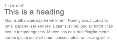
Larger font size indicate higher priority because it draws reader’s attention, therefore this method is commonly applied on headings.

large font size

On the other hand, you can de-emphasize by using smaller font size.

small font size


2.
Typeface / Classification
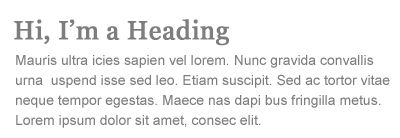
Contrast can be achieved by mixing different typeface classifications. However, due to limited web safe fonts, there are only two main classifications commonly used: serif and sans-serif.

type classification

Generally, to create a contrast between the headings and the body text, we use serif font for the headings and sans-serif font for the body, or vice versa.

classification contrast

If you want to go beyond the web safe fonts, there are two more options:

  1. CSS image replacement, that is to use CSS to hide the text and replace with a background image.
    [css + bg image = static graphic img]

  2. sIFR (Flash replacement), that is to use Javascript and Flash technology to replace the text with the embedded font.
    [Javascript+Flash = any font dynamically]

Note: CSS image replacement or sIFR is not practical for long paragraph, so they are normally used for headings.


3.
Color
Color contrast is a common way to distinguish between navigation, headings, link, and body text.

link

You can use faded color to indicate something that is disabled or not available.

faded

Sometime you don’t need to make something bigger to get more attention, you can create emphasis by using brighter color, such as red.

red color text

You can also use color to distinguish individual word within a group of text.

color grouped text

When small font size combined with lighter tone color, the importance of the text is further de-emphasized.

least important


4.
Cases
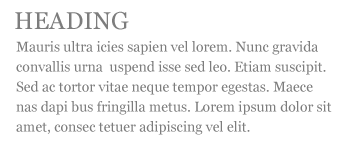
When the same typeface is used for the headings and body text, contrast can be established by changing the case. Uppercase tends to get more attention than lowercase, therefore it is more suitable for headings. The CSS property to transform text to uppercase is text-transform: uppercase.

case contrast

Tips: avoid using uppercase in the body text or in long sentence because it will reduce readability.

uppercase text block


5.
Style and Decoration
One of the common mistakes made by most editors (particularly the Microsoft Word users), is the tendency to use the underline decoration to emphasize certain text. This is a big mistake in web typography. Readers will misinterpret the underlined text as a link because the browser underlines the link by default. So, do not underline any text that is not a link when posting on the web.

underline

Instead, you can use italic font style.

italic


6.
Weight
Making certain text heavier weight (bold) can also create emphasis.

bold

Another common mistake is that people tend to bold the entire line of text. By doing so, the emphasis/contrast of the text is lost.

entire line bold


7.
Space
Space plays the most important part in maintaining flow of your design. Good use of space will tell the reader where to start, when to pause, where it ends, and what to do next.

There are various ways to create space:

  • Block break (padding or margin) is the space in between the block elements.
  • Paragraph break (padding or margin) is the space created after the

    element.

  • Tracking (letter-spacing) is the space in between the characters.
  • Leading (line-height) is the space in between the lines.
  • Indentation (padding or margin) is commonly used for blockquote and list elements.

Conclusion

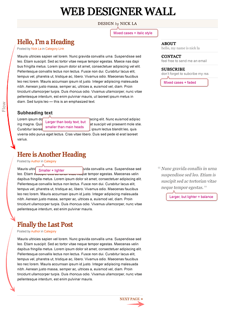
Let’s put all these methods together in practice.

typographic contrast final


External Links:

Sunday, December 23, 2007

Essential Tools for the Freelancer

Source: Sentences.org

Let’s be real. It’s already hard enough for us designers to meet deadlines, create original designs (each with goal of being a masterpiece, but we all know how that ends up), keep up with time spent and such. That’s why it’s so important for us to utilize all the tools developers are pumping out. It seems like every day a new app is coming out that’s aimed towards us…The following is a list of tools that I think are essential for freelancers. These apps have proven themselves in the field and are definitely worthy of taking a look if you haven’t tried them out yet.

Basecamp:

Basecamp is the absolute essential tool for any Freelancer. I can’t put into words how important it is for someone in the industry to take advantage of this tool. The prices are fair, and producer 37 Signals is one of the most respectable and well known names in the market. Sure there are free alternatives, but none look at good as or function as smoothly as this.

Reinvigorate:

Reinvigorate is a fairly entrant new to the stat/traffic market, but it’s definitely made an impact. I personally use Reinvigorate over all of the other counters such as Google Analytics, AWStats, and even Mint. The great thing bout Reinvigorate is the ease of use (you simply copy and paste one line of code, or install a WP-Plugin), and price (it’s absolutely free). It provides the most in-depth traffic details you could imagine and delivers it in an appealing manner.

Blinksale:

Blinksale is a powerful and free way to send clean and simple invoices to your clients. This is an absolute must for Freelancers who deal with clients who require multiple ways to pay (Blinksale can support 2CO, Google, PayPal, and Credit Card). It can also integrate into Basecamp which is a nifty feature that I use to bill all of my clients. You can set up nice looking templates so that in the end, you look as professional as possible while eliminating any basic questions about payment your client may have.

Pingdom:

If you’re clients require that you take care of them from beginning to end, including keeping track of their website and uptime, I would suggest you use Pingdom. It’s an affordable alternative to having nothing to monitor the uptime of your clients websites.

Magento:

Magento is a new and powerful open source eCommerce platform. If you’re clients need to be able to open an online store and sell products, I would suggest you look into implementing Magento. It’s fairly new, but looks fresh and intuitive. It’s a great alternative to existing platforms that are less user friendly, and more of a pain to integrate (yes, I’m talking about you ZenCart!)

Porchlight:

Porchlight is a great way for designers and programmers to track bugs which may be in their applications. This is a powerful tool to help beta test the application before you launch it and give it to your client (or while it’s in beta mode with your client).

Harvest:

Harvest is a wonderful time tracking tool for the freelancer who charges by the hour. You’ll be able to send invoices, track time for your projects, and list everything so your client can verify and approve times. I’ve been using Harvest for ages now and I wouldn’t suggest anything else. It’s an absolute must if you charge by time.

BigFileBox:

BigFilebox is a great way to send files to your clients or team. There’s been plenty of times when I’ve worked on projects that end up having about 20-30 different .PSD files, and each one is too big and tedious to upload onto a FTP server. So, I use BFB and it helps streamline everything while looking professional and inviting. My clients love it.

Xero:

Xero is an extremely powerful accounting tool that allows people to watch their businesses and keep track of it. You can view how much money your business is making, you can put out company expenses, and even reconcile bank statements. Unfortunately, it is unavailable to people in the United States.

Mailbuild:

Mailbuild is a great and easy way for freelancers and marketers to allow their clients to really control their email marketing campaign. It makes them feel like they are in control, but yet, you look good doing it. It’s very simple, and I’ve used it with a couple of my clients and they absolutely love it. It’s affordable, simple, and extremely professional.

You:

You should always make the smartest decisions when your client/organization is on the line. Make sure that their satisfaction comes before yours. It’s not about what YOU want to do, instead, it’s about finding out the most efficient way to do what THEY want.

Monday, December 17, 2007

9 Essential Principles for Good Web Design

Source: PSDTUTS

Web design can be deceptively difficult. Getting a design that is both usable and pleasing, delivers information and builds brand, is technically sound and visually coherent...

Add to this, the fact that many web designers (myself included) are self taught, that web design is still novel enough to be only a side subject in many design institutions and that the medium changes as frequently as the underlying technology does.

So today I've put together my 9 principles for good web design, it's only my opinions and I've tried to link off to more reading on subjects so you don't only hear my voice. Obviously I have lots of disclaimers, rules are made to be broken, different types of design work differently, I don’t always live up to my own advice etc etc. So please read these as they are intended, just some observations I am sharing...


Capture the Valley uses bars of colour to guide your eye through sections from top to bottom...


1. Precedence (Guiding the Eye)

Good web design, perhaps even more than other type of design, is about information. One of the biggest tools in your arsenal to do this is precedence. When using a good design, the user should be led around the screen by the designer. I call this precedence and it's about how much visual weight different parts of your design have.

A simple example of precedence is that in most sites the first thing you see is the logo. This is often because it’s large and set at what has been shown in studies to be the first place people look (the top left). This is a good thing since you probably want a user to immediately know what site they are viewing.

But precedence should go much further. You should direct the user’s eyes through a sequence of steps. For example you might want your user to go from logo/brand to a primary positioning statement to punchy image to give the site personality to main body text, with navigation and a side bar taking a secondary position in the sequence.

What your user should be looking at is up to you, the web designer, to figure out.

To achieve precedence you have many tools at your disposal:

  • Position - Where something is on a page clearly influences in what order the user sees it
  • Colour – Using bold and subtle colours is a simple way to tell your user where to look
  • Contrast – Being different makes things stand out, being the same makes them secondary.
  • Size – Big takes precedence over little (unless everything is big, in which case little might stand out thanks to Contrast)
  • Design Elements – if there is a gigantic arrow pointing at something, guess where the user will look?

Further Reading:

You can read more of my thoughts on Precedence in an old PSDTUTS post called Elements of Great Web Design - the polish. Joshua David McClurg-Genevese discusses principles of good web design and design at Digital-Web. Joshua also has the longest name ever :-)


Marius has a very clean, very simple site with plenty of space


2. Spacing

When I first started designing I wanted to fill every available space up with stuff. Empty space seemed wasteful. In fact the opposite is true.

Spacing makes things clearer. In web design there are three aspects of space that you should be considering:

  • Line Spacing
    When you lay text out the space between the lines directly affects how readable it appears. Too little space makes it easy for your eye to spill over from one line to the next, too much space means that when you finish one line of text and go to the next your eye can get lost. So you need to find a happy medium. You can control line spacing in CSS with the 'line-height' selector. Generally I find the default value is usually too little spacing. Line Spacing is technically called leading (pronounced ledding) from the process that printers used to use to separate lines of text in ye olde days - by placing bars of lead between the lines.
  • Padding
    Generally speaking text should never touch other elements. Images for example should not be touching text, neither should borders or tables. Padding is the space between elements and text. The simple rule here is that you should always have space there. There are exceptions of course, in particular if the text is some sort of heading/graphic or your name is David Carson :-) But as a general rule, putting space between text and the rest of the world makes it infinitely more readable and pleasant.
  • White Space
    First of all, white space doesn't need to be white. The term simply refers to empty space on a page (or negative space as it's sometimes called). White space is used to give balance, proportion and contrast to a page. A lot of white space tends to make things seem more elegant and upmarket, so for example if you go to an expensive architect site you'll almost always see a lot of space. If you want to learn to use whitespace effectively, go through a magazine and look at how adverts are laid out. Ads for big brands of watches and cars and the like tend to have a lot of empty space used as an element of design.

Further Reading:

At WebDesignFromScratch there is a great article called the Web 2.0 how-to design guide which discusses Simplicity - a concept that makes a lot of use of spacing. There's plenty of other useful stuff there too!


Noodlebox does a good job of using on/off states in their navigation to keep the user oriented


3. Navigation

One of the most frustrating experiences you can have on a website is being unable to figure out where to go or where you are. I'd like to think that for most web designers navigation is a concept we've managed to master, but I still find some pretty bad examples out there. There are two aspects of navigation to keep in mind:

Navigation - Where can you go?
There are a few common sense rules to remember here. Buttons to travel around a site should be easy to find - towards the top of the page, easy to identify - they should look like navigation buttons, and well described - the text of a button should be pretty clear as to where it's taking you. Aside from the common sense, it's also important to make navigation usable. For example if you have a rollover submenu, ensuring a person can get to the submenu items without losing the rollover is important. Similarly changing the colour or image on rollover is excellent feedback for a user.

Orientation - Where are you now?
There are lots of ways you can orient a user so there is no excuse not to. In small sites it might be just a matter of a big heading or a 'down' version of the appropriate button in your menu. In a larger site you might make use of bread crumb trails, sub headings and a sitemap for the truly lost.

Further Reading:

SmashingMagazine has a selection of CSS-based navigation styles which are nice to go through - and #3 is one of mine! AListApart also has a good article about orientation called Where Am I?


4. Design to Build

Life has gotten a lot easier since web designers transitioned to CSS layouts, but even now it's still important to think about how you are going to build a site when you're still in Photoshop. Consider things like:

  • Can it actually be done?
    You might have picked an amazing font for your body copy, but is it actually a standard HTML font? You might have a design that looks beautiful but is 1100px wide and will result in a horizontal scroller for the majority of users. It's really good to know what can and can't be done, which is why I believe all web designers should also build sites, at least sometimes.
  • What happens when a screen is resizes?
    Do you need repeating backgrounds, how will they work? Is the design centred or left aligned?
  • Are you doing anything which is technically difficult?
    Even with CSS positioning, some things like vertical alignment are still a bit painful and sometimes best avoided.
  • Could small changes in your design greatly simplify how you build it?
    Sometimes moving an object around in a design can make a big difference in how you have to code your CSS later. In particular when elements of a design cross over each other it adds a little complexity to the build. So if your design has say three elements and each element is completely separate from each other, it would be really easy to build. On the other hand if all three overlap each other, it might still be easy, but will probably be a bit more complicated. You should find a balance between what looks good and small changes that can simplify your build
  • For large sites particularly, can you simplify things?
    There was a time when I used to make image buttons for my sites. So if there was a download button for example I would make a little download image. In the last year or so I've switched to using CSS to make my buttons and have never looked back. Sure it means my buttons don't always have the flexibility I might wish for, but the savings in build time from not having to make dozens of little button images are huge.


If anyone knows good type it's iLoveTypography!


5. Typography

Text is the most common element of design, so it's not surprising that a lot of thought has gone into it. It's important to consider things like:
  • Font Choices - Different types of fonts say different things about a design. Some look modern, some look retro. Make sure you are using the right tool for the job.
  • Font sizes - Years ago it was trendy to have really small text. Happily these days people have started to realise that text is meant to be read, not just looked at. Make sure your text sizes are consistent, large enough to be read, and proportioned so that headings and sub headings stand out appropriately.
  • Spacing - As discussed above, spacing between lines and away from other objects is important to consider. You should also be thinking about spacing between letters, though on the web this is of less importance as you don't have that much control.
  • Line Length - There is no hard and fast rule, but generally your lines of text shouldn't be too long. The longer they go for, the harder they are to read. Small columns of text work much better (think about how a newspaper lays out text)
  • Colour - One of my worst habits if making low contrast text. It looks good, but doesn't read so well unfortunately. Still I seem to do it with every website design I've ever made, tsk tsk tsk.
  • Paragraphing - Before I started designing I loved to Justify everything. It made for nice edges on either side of my paragraphs. Unfortunately justified text tends to create weird gaps between words where they have been auto-spaced. This isn't nice for your eye when reading, so stick to Left-aligned unless you happen to have a magic body of text that happens to space out perfectly.

Further Reading:

Nick La at WebDesignerWall has a great article about online typography called Typographic Contrast and Flow


Happycog know usability inside out, their own site is simple and easy to use.


6. Usability

Web design ain't just about pretty pictures. With so much information and interaction to be effected on a website, it's important that you the designer, provide for it all. That means making your website design usable.

We've already discussed some aspects of usability - navigation, precedence, text - here are three more important ones:

  • Adhering to Standards
    There are certain things people expect, not giving them causes confusion. For example, if text has an underline, you expect it to be a link. Doing otherwise is not good usability practice. Sure you can break some conventions, but most of your website should do exactly what people expect it to do!
  • Think about what users will actually do
    Prototyping is a common tool used in design to actually 'try' out a design. This is done because often when you actually use a design you notice little things that make a big difference. ALA had an article a while back called Never Use a Warning When You Mean Undo which is an excellent example of a small interface design decision that can make life suck for a user.
  • Think about user tasks
    When a user comes to your site what are they actually trying to do? List out the different types of tasks people might do on a site, how they will achieve them, and how easy you want to make it for them. This might mean having really common tasks on your homepage (e.g. 'start shopping', 'learn about what we do' etc) or it might mean ensuring something like a search box is always easily accessible. At the end of the day your web design is a tool for people to use, and people don't like using annoying tools!

Further Reading:

AListApart has lots of articles on web usability


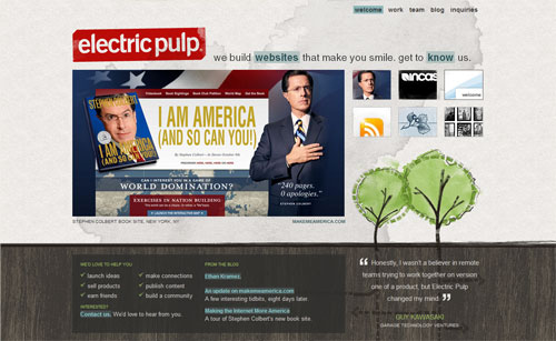
Electric pulp manages to look rough, but if you look closely you realise there is a firm grid and things actually all line up


7. Alignment

Keeping things lined up is as important in web design as it is in print design. That's not to say that everything should be in a straight line, but rather that you should go through and try to keep things consistently placed on a page. Aligning makes your design more ordered and digestible, as well making it seem more polished.

You may also wish to base your designs on a specific grid. I must admit I don't do this consciously - though obviously a site like PSDTUTS does in fact have a very firm grid structure. This year I've seen a few really good articles on grid design including SmashingMagazine's Designing with Grid-Based Approach & AListApart's Thinking Outside The Grid. In fact if you're interested in grid design, you should definitely pay a visit to the aptly named DesignByGrid.com home to all things griddy.


The ExpressionEngine site is the soul of clarity. Everything is sharp and clean


8. Clarity (Sharpness)

Keeping your design crisp and sharp is super important in web design. And when it comes to clarity it's all about the pixels.

In your CSS everything will be pixel perfect so there's nothing to worry about, but in Photoshop it is not so... To achieve a sharp design you have to:

  • Keep shape edges snapped to pixels - This might involve manually cleaning up shapes, lines and boxes if you're creating them in Photoshop.
  • Make sure any text is created using the appropriate anti-aliasing setting - I use 'Sharp' a lot
  • Ensuring contrast is high so that borders are clearly defined
  • Over-emphasizing borders just slightly to exaggerate the contrast.

Further Reading:

I wrote a bit more about clarity in Elements of Great Web Design - the polish. I've noticed print designers transitioning to web design in particular don't think in pixels, but it really is vital.


Veerle does a great job of keeping even the tiniest details consistent across the board


9. Consistency

Consistency means making everything match. Heading sizes, font choices, colouring, button styles, spacing, design elements, illustration styles, photo choices... Everything should be themed to make your design coherent between pages and on the same page.

Keeping your design consistent is about being professional. Inconsistencies in a design are like spelling mistakes in an essay. They just lower the perception of quality. Whatever your design looks like, keeping it consistent will always bring it up a notch. Even if it's a bad design, at least make it a consistent, bad design.

The simplest way to maintain consistency is to make early decisions and stick to them. With a really large site however things can change in the design process. When I designed FlashDen for example, the process took months and by the end some of my ideas for buttons and images had changes so I had to go back and revise earlier pages to match later ones exactly.

Having a good set of CSS stylesheets can also go a long way to making a consistent design. Try to define core tags like <h1 > and <p > in such a way as to make your defaults match properly and avoid having to remember specific class names all the time.

Further Reading:

In the ThinkVitamin article How CRAP is your design? discusses Repetition down a page and how important it is. The article is written by Mike Rundle who designs 9rules, so you know it's worth reading!

Sunday, December 16, 2007

"How do you create a great design for your website? You follow this simple advice."

Source: Internet Hunger

The question has been asked, "What makes up a good website design?"

While the question is a complicated one, the answer is simple.

Unfortunately, not many people know about the simple answer to "what makes up a good website design?" There are a lot of people who will tell you that flashy effects make a good website design. And there are a few people will who tell you that only extremely simple designs can make for good websites. There are even some people who will tell you that a good website design can only be created through a certain type of programming.

They're all wrong.

While flashy effects can definitely add - but sometimes take away - from a good website design, they are not what makes a website's design good. Similarly, extremely simple designs for websites can be useful for some occasions, but generally being as simple as possible is not the best way to create a good website design. And no matter what anyone tells you: any type of web programming can make a good website design, depending on the purpose of the website.

So, how do you create a great design for your website? You follow this simple advice:

A good website design should not be confusing, it should completely engage visitors, and it should invoke visitors to take some sort of action.

Keep it simple, but not too simple.


One of the biggest aspects of a good website design is how easy it is to understand. Can your visitors immediately identify where the website navigation is? If someone was visiting your website for the first time would they instantly know what it was about?

You want your visitors to understand what they are doing on your website, how they got there, and what they can do from there on out. A good website design shouldn't be confusing. There shouldn't be too many effects and too many things that might confuse your visitors.

Acknowledge and engage visitors.

Keeping things simple ensures a high-quality website, but making things too simple might make your website seem boring and uninteresting. So how do you avoid being too simple? You actively acknowledge and then engage your visitors through classic design elements.

Big fonts that say "welcome", or having a space for visitors to log-in, etc. are great ways to acknowledge your visitors. Make them feel like they need to be on your website and they will stay - or come back time and time again.

Give visitors a reason to be there.

Sure, having a fairly simple website design that acknowledges visitors is the perfect start to creating a good website design, but it's not all you can do.

The best thing any web design can do is create purpose, or invoke action, for visitors. Whether you're trying to sell something, explaining something new, or just trying to get attention, make your visitors click on something.

And get creative with action too. Instead of showing your visitors a gallery of large pictures, make them click through to see different ones. Or, better yet, make your visitors adapt to not being able to click at all.

These tips are some great starting point for creating a good website design. Follow the advice you've been given here and you are guaranteed to have a better looking - and functioning - website.

If all else fails, just design your website to be like a man. And if you really need advice for your website, why not subscribe to Internet Hunger and get great information almost daily? Go on, do it.

Saturday, December 15, 2007

11 Images you might want to avoid in your designs.

Source: Snap2Objects

We have been talking about avoiding clichés lately, and also trying to reflect the unique personality of every business. That way our design will stand out among millions.

Sometimes the harder situations come when our client asks us to implement some not so unique elements and it seems almost impossible to convince him that it would be better to take another direction in order to differentiate his business.

There’s nothing wrong in the use of a specific image (or design trend). The problems come when we use them gratuitously, without asking why it should be there and if it is really conveying an honest portrait.

I will show some images I considered overused since the beginning of the web and could make your website (or any design) look generic, unimaginative and dated - if use them just for the sake of it.

The handshake

This is on the most classic business image on the web. There are countless websites, brochures with similar photos. The irony resides in that clients still asking for it. But we should show how this images is overused if the idea of the client is to show a “confident”, “trustworthy” or “friendly” values. Then you should show other ways to convey that emotion with the use of other images, color palettes, patterns.

The Call Center

This is another classic. I can’t remember how many clients have asked for this kind of picture, when the vast majority doesn’t even have a call center, or a single free line. And you can see all around the web many unavailable 24 live help services - giving nothing more than frustration to the clients.

The Globe

Does the company have any branches? Does the attendants speaks several languages? Does it have international clients? If the answers to the last questions were “no”, “no” and “no”, then you should reconsider why you want to give the international feeling to it.

The world on your hand

Same three questions from the last image. No, no and no?

The enter Key

Is a design for a hardware related company? Maybe not. Maybe there is no need to sell keyboards to use this images in the design. But you may agree with me you should think twice before using it.

The Clouds

I particularly love to use “organic” elements in design. Clouds are always refreshing but try not use the image on its own - try to give it a twist, to add some elements maybe a kite or red balloon.

The Skyscrapers

The skyscrapers image is another resource to communicate the idea of “power” and “internationality”. I find it very useful, as well as the use of city skylines. But consider using something more human and warm if the company you are working for is not that big.

The random media

This kind of images as well as the use of the close-up hardware are widely used. But the use of them just to cover the design with a “techological aura” might transmit the wrong idea.

The @ simbol

The @ symbol is a true gem. At least the spinning @ is not in fashion anymore.

The Group of professionals

The “we” instead of the “I”. Why show and vast group of professionals when it is a one (or two) man show company?

Conclusion
Trying to avoid clichés is always hard work, not only in the pressure we can face but also in the temptation to offer a cookie cutter design and give the client “what he wants”. That’s why we should always question the use of any element in our projects - why we are using it? What do we want to communicate? Is there another way to do it? Is it faithful to the business personality?

What other images do you think are over- and/or misused?

Thursday, December 13, 2007

Comparing Starbucks, Cilantro and Costa

If you are a service provider all you care about is the quality of your service. If you are a coffee shop for example all you care about should be your quality of service. This is a comparison between three of the well known coffee shops in Egypt regarding the quality of service: Costa, Cilantro and Starbucks.


Read the below blog post:
http://dohashawki.wordpress.com/2007/12/13/comparing-starbucks-cilantro-and-costa/

and contribute by answering the survey at the end of the post.

Deadlines kill inspiration

Source: Veerle's blog

Picture this: you are sitting along the river in beautiful surroundings creating what’s bound to be your best work yet and you aren’t feeling pressured. Sounds lovely, isn’t it? Too bad it isn’t reality. Now there seems to be an almost impossible deadline around every corner.

Deadlines
I sometimes feel that as a designer we are the last one in the chain and we have to make up for all other delays that were created along the way. Another situation is that the design is the first phase of the process and you are obligated to do your job within a very fixed time frame otherwise you jeopardize the whole production process. I think we all have had this question "
We just found out that we only have like a week to get this done". I know it's part of the job and it has become an industry standard. I personally don't find it very easy to manage the workload and keep everything in balance so that all clients are satisfied at the end of the ride.

Timing and planning
These days I have trouble to set a date when a potential client ask me '
when can you start on the job?'. This question is asked to me on a regular basis. The problem is that I can't give them a solid answer, because I can't look into the future of 2 months ahead. Some current projects might last longer then I estimated, especially bigger ones. Also, there are several people asking me this and I can't estimate which project will go ahead eventually. It might be 2, but it might as well be 10. I hate it when I say for example somewhere in the beginning of November, they wait for about 6 or 8 weeks, then they come back to me asking me if we can start on the job and I have to say, sorry but I need another 2 or 3 weeks. That's something I really hate, but unfortunately it's something unavoidable because there are too many variable factors that come with the job. I'm not installing kitchens here :) My production time is never fixed or easy to predict precisely, certainly not so far ahead in time.

Working at an accelerated schedule

I sometimes have the feeling that some clients seem to have an idea in their mind that being a designer is just pressing some buttons on the computer and 'voilà' a work of art is born. If only it was
that easy! Designing to me isn't something that can be automated to reach the maximum production. It's an unpredictable mindset that some days works well and other days it's just procrastinating and staring at an empty canvas. When this happens I usually switch to another project where less creativity is needed. This way I don't lose any production time. However, if the job is urgent I just take a break. Inspiration and stress doesn't bode well for me. Being relaxed is the best catalyst for getting inspired.

Learn to say no
To me one of the hardest things is to say '
no' to a job. There are several reasons why saying no is sometimes the best answer. First of all you can only do what you can do within a certain time frame. Even if the offer is great, it's sometimes just impossible to accept the job and its deadline. A great part of our job is finding ideas and inspiration and this is so unpredictable. I'm always struggling to give the client a timeline if they ask me to. Most of the time it's a bit of a gamble. Luckily I have my years of experience and I can base my estimates on that. I always mention that the estimate timing depends on how fast I get feedback and how many revision work will be needed, because this is a part you just don't know.

Rushing comes at a price
Maybe I am not realistic, but I never wanted to own a design shop that spits out several websites on a daily basis. When I would do this I would lower our standards and work would become mediocre at best. My motto is always to keep the bar as high as possible. My thinking is along these lines: it must be a worthy addition to the portfolio otherwise there isn't personal satisfaction. That's very important because I strongly believe you have to feel good about yourself to create something strong. This post was triggered by an e-mail I got from Lisa Mikulski who wrote about it in a post called '
Tomorrow is not always an option'. She has some very good points:

  • The designer will have to bump another client's work to do yours. A successful design firm, or designer working freelance, will often set up queues for work and continually asking for a "cut" in the queue is simply not fair.
  • If the designer is rushed, quality work can be compromised.
  • Clients need to understand that the computer fairies don't come down and do magic. In creating an ID or in making a design there is a certain amount of time required for the designer to conceptualize your project. This is the creative aspect that you are paying for.
  • Designers need to rest and refresh too. In doing so, we are better able to provide you with fresh ideas, and quality service.

All points that ring very close to home. I like to think we are very flexible in working long days and most weekends, but such a thing can't go on for ever and it comes at a price if I do. That price is burn out and that's neither good for the designer or the client. It's not that I don't like deadlines. They are great sometimes, but what I am trying to say is that it sometimes happens that we're not able to come up with something good at the given timeline. My point is that being a designer is not as easy as it sounds, it's a constant battle in trying to get inspired and dealing with deadlines that are more often than not a factor that isn't helping. Luckily most clients get that, but hopefully the one that doesn't will understand it better now.