11 Images you might want to avoid in your designs.
We have been talking about avoiding clichés lately, and also trying to reflect the unique personality of every business. That way our design will stand out among millions.
Sometimes the harder situations come when our client asks us to implement some not so unique elements and it seems almost impossible to convince him that it would be better to take another direction in order to differentiate his business.
There’s nothing wrong in the use of a specific image (or design trend). The problems come when we use them gratuitously, without asking why it should be there and if it is really conveying an honest portrait.
I will show some images I considered overused since the beginning of the web and could make your website (or any design) look generic, unimaginative and dated - if use them just for the sake of it.
The handshake
This is on the most classic business image on the web. There are countless websites, brochures with similar photos. The irony resides in that clients still asking for it. But we should show how this images is overused if the idea of the client is to show a “confident”, “trustworthy” or “friendly” values. Then you should show other ways to convey that emotion with the use of other images, color palettes, patterns.
The Call Center
This is another classic. I can’t remember how many clients have asked for this kind of picture, when the vast majority doesn’t even have a call center, or a single free line. And you can see all around the web many unavailable 24 live help services - giving nothing more than frustration to the clients.
The Globe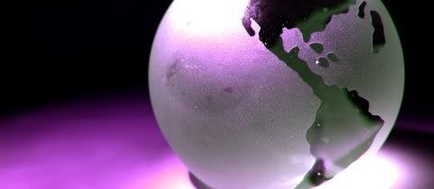
Does the company have any branches? Does the attendants speaks several languages? Does it have international clients? If the answers to the last questions were “no”, “no” and “no”, then you should reconsider why you want to give the international feeling to it.
The world on your hand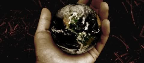
Same three questions from the last image. No, no and no?
The enter Key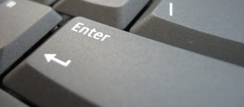
Is a design for a hardware related company? Maybe not. Maybe there is no need to sell keyboards to use this images in the design. But you may agree with me you should think twice before using it.
The Clouds
I particularly love to use “organic” elements in design. Clouds are always refreshing but try not use the image on its own - try to give it a twist, to add some elements maybe a kite or red balloon.
The Skyscrapers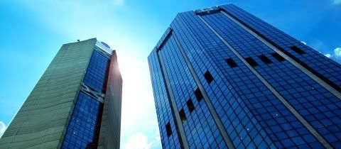
The skyscrapers image is another resource to communicate the idea of “power” and “internationality”. I find it very useful, as well as the use of city skylines. But consider using something more human and warm if the company you are working for is not that big.
The random media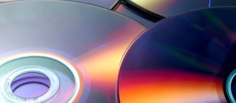
This kind of images as well as the use of the close-up hardware are widely used. But the use of them just to cover the design with a “techological aura” might transmit the wrong idea.
The @ simbol
The @ symbol is a true gem. At least the spinning @ is not in fashion anymore.
The Group of professionals
The “we” instead of the “I”. Why show and vast group of professionals when it is a one (or two) man show company?
Conclusion
Trying to avoid clichés is always hard work, not only in the pressure we can face but also in the temptation to offer a cookie cutter design and give the client “what he wants”. That’s why we should always question the use of any element in our projects - why we are using it? What do we want to communicate? Is there another way to do it? Is it faithful to the business personality?
What other images do you think are over- and/or misused?
posted by Unknown at
12:08 PM
![]()

0 Comments:
Post a Comment
Subscribe to Post Comments [Atom]
<< Home